“Let frustration fuel inspiration.” – Sonia Boyce

January 2, 2017

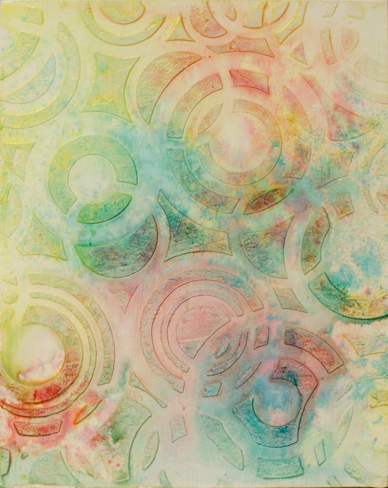
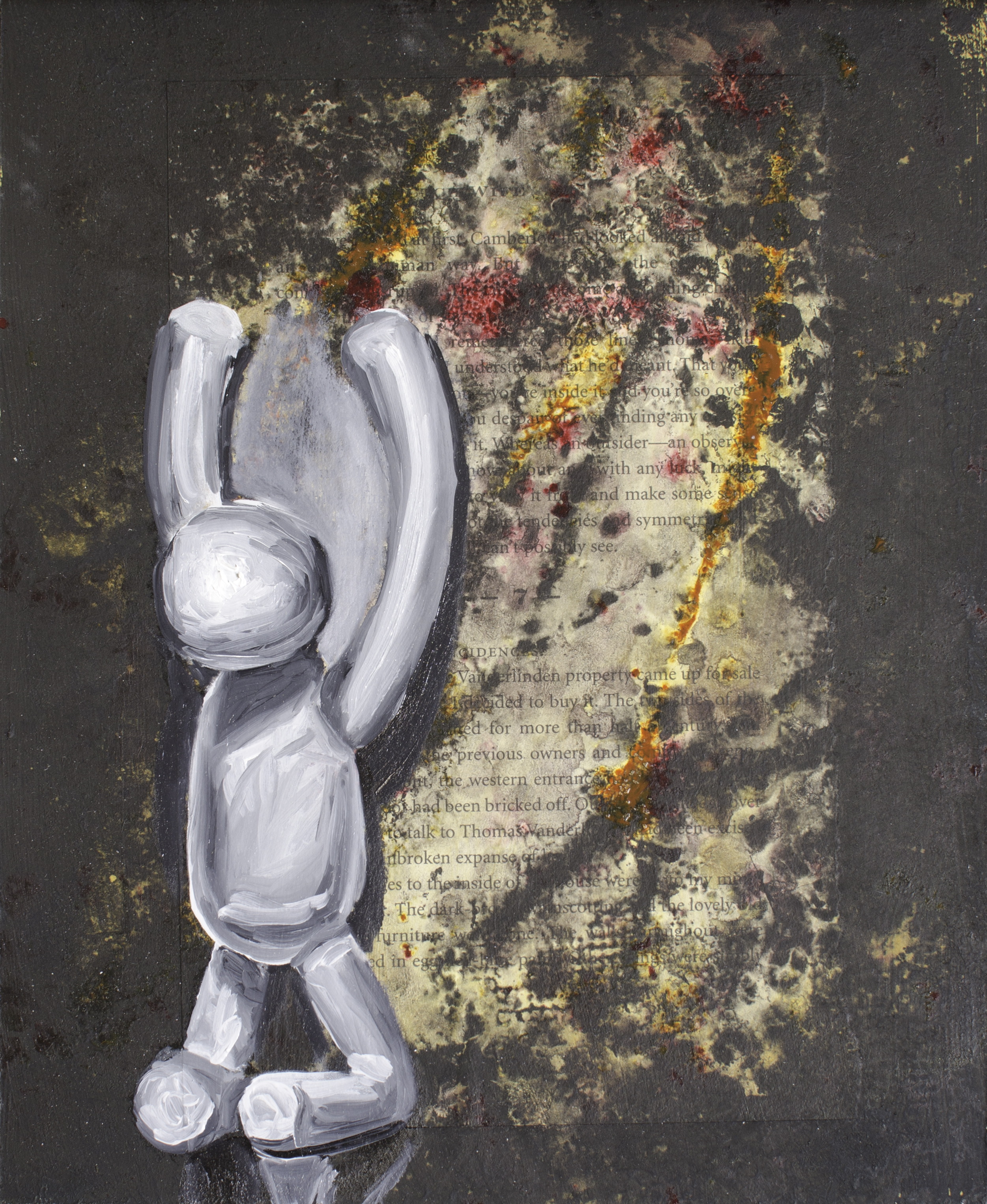
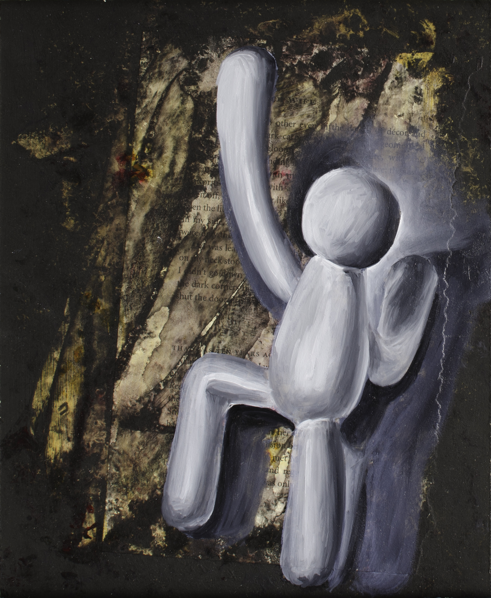
This is a group of three panels that currently don’t look like much, but will hopefully evolve into something interesting. I want to play a little with shallow space, text and layers. I’ve started them in acrylic, but will shift to oils with cold wax medium to see if I can work with translucency as well. I have a lovely vision – time will tell how close I manage to come to what is in my head.

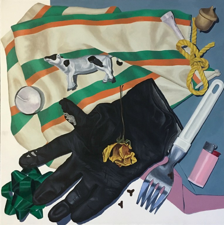
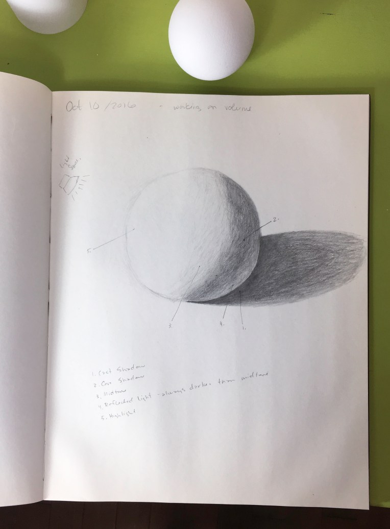
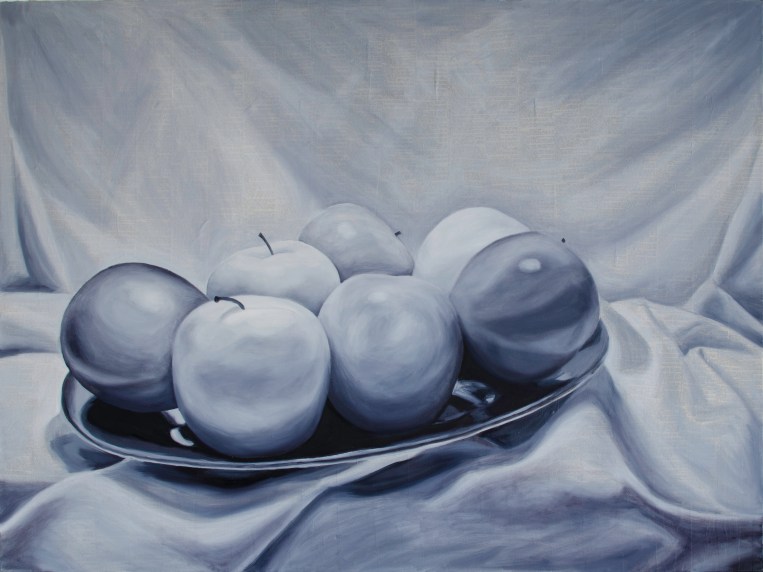
With the beginning of the new year, I’m full of ambition. I want to make 2017 a more prolific year than I’ve had for awhile and I am focussing both on developing skills and on experimentation. This isn’t anything new, but I have a renewed energy to bring it about. I intend to draw daily this year and post at least some of the images to Instagram and some here as well from time to time. When I look around my studio I see too many unfinished pieces, so I will be trying to finish work on them. And I seem to have developed a habit of painting over canvases and boards repeatedly if I’m not fond of how they look – again – this idea of layers that I find intriguing. We’ll see what other trends come out of the year. It’s a new year and I feel there are endless possibilities ahead. We’ll see how they unfold…

“Criticism is something we can avoid easily by saying nothing, doing nothing, and being nothing.” —Aristotle

October 10, 2016

The Box, 1994, Acrylic on Masonite, 22.5" X 24"
The Box, 1994, Acrylic on Masonite, 22.5″ X 24″


Venus Averaged, 1995, Acrylic on Canvas, 33" X 45"
Venus Averaged, 1995, Acrylic on Canvas, 33″ X 45″


I spent the weekend out of town visiting family. With no time at home to paint, instead I’m posting two paintings from long ago that I found hanging on the walls of my mom’s and my sister’s homes. Both of them make me think I should play with similar ideas again.

The top image was an exercise in rendering shallow depth and a variety of textures with a still life built in a pizza box. There are so many things about this image that leave room for improvement.

Venus Averaged was one in a series of images inspired by the work of Chuck Close. My take on it was to break Venus up into a grid and then lay down the average of the colours that appear within that grid onto my canvas in the same grid location. Once complete, is the image still recognizable as Venus? Pushed further, at one point does the image become unrecognizable? It’s a little like seeing someone you know from a distance – how much detail do you need in order to recognize them? There were a few other canvases in this series but I don’t recall if I ever formed any answers to these questions.

Back home today I was able to spend a little time drawing and making notes about shadows.

a bit of practice working on creating volume


“Nobody is smarter than you are. And what if they are? What good is their understanding doing you?” ― Terence McKenna

April 4, 2016

Stencil One WIP, Mar 20, 2016, Mixed Media on Canvas, 6" X 6"
Stencil One WIP, Mar 20, 2016, Mixed Media on Canvas, 6″ X 6″ – photo taken after step 7.
Stencil One WIP, Apr 3A, 2016, Mixed Media on Canvas, 6″ X 6″
Stencil One WIP, Apr 3A, 2016, Mixed Media on Canvas, 6″ X 6″ – photo taken after step 9.
Stencil One, Apr 3, 2016, Mixed Media on Canvas, 6″ X 6″
Stencil One, Apr 3, 2016, Mixed Media on Canvas, 6″ X 6″ – end result after step 10.

In January I attended a demo of Golden products where I was inspired to pick up a few new items to try out. This isn’t exactly what I had hoped it would be, but I learned some things along the way. Here’s my process:

  1. Black gesso on the edges of a 6″ X 6″ canvas
  2. Golden fibre paste applied with a stencil to create a raised design
  3. Slight sanding of the fibre paste to soften the edges a bit – this wasn’t all that effective due to the spring of the canvas though
  4. Soaked the surface fairly thoroughly by spraying it with water
  5. Applied drops of Golden high flow acrylics: indigo, dioxazine purple, green gold, iridescent pearl
  6. Applied spray inks
  7. Sprayed water here and there, removed water here and there, all rather haphazardly
  8. Repeated steps 5-7 again
  9. Three thick coats of Golden clear tar gel. A slight misting of rubbing alcohol helped to eliminate the bubbles on the surface.
  10. Hand-lettered text added with a Golden marker and high flow acrylic in Indigo

Notes:

  1. As much as I tried, I was unable to get the hi-flow acrylic to bleed like watercolour. I will play with this more and see if I can accomplish it yet.
  2. I really should have taken another photo after I finished adding colour and before the clear tar gel (next time I will)
  3. I’m a little concerned that the very thick layer of clear tar gel may crack as I chose a canvas support for this one. I will try it on masonite next to see what happens there.
  4. I had wanted to build the tar gel up until it created a smooth surface, but at three coats it seemed to becoming the slightest bit cloudy so I stopped there, even though it still has uneven areas.
  5. I like the depth that is created between the background and the paint applied to the surface of the tar gel. It might be interesting to build up an image between layers of tar gel to see what that would do.
  6. Next time I clean the marker, I have to remember to remove the ball-bearings from the marker BEFORE dumping any unused paint down the drain. Sadly, I did NOT do this and my ball-bearings are now somewhere in the drain system rather than in the marker itself.

The text I chose was inspired by:

  • Austin Kleon
  • the last four kilometres of my long run yesterday in preparation for next month’s half-marathon
  • the general malaise and lack of inspiration I’ve been experiencing in my artwork lately.

I’m still working on my second experimental stencil piece and we’ll see how that one turns out.


“Writing about art is only useful when it leads to the experience of art.” – Darby Bannard

February 8, 2016

Something a little different today. On December 31, my kids and I visited the Art Gallery of Alberta. One of the exhibitions was of the work of Chris Cran – my current favourite Alberta artist. After seeing some of his work with paintings of half-toned images, I thought I’d play a little. This is more of an experiment to see how the technique would work in preparation to play with these ideas more in future pieces.

Pink Stripes WIPA, Feb 7, 2016, Acrylic on Canvas, 6" X 6"
Pink Stripes WIPA, Feb 7, 2016, Acrylic on Canvas, 6″ X 6″

I started by painting the surface of a 6″ X 6″ canvas with flourescent pink acrylic paint and the edges with black gesso. Then I taped stripes onto the surface and covered it with a layer of acrylic gloss medium.

Pink Stripes WIPB, Feb 7, 2016, Acrylic & Oil on Canvas, 6" X 6"
Pink Stripes WIPB, Feb 7, 2016, Acrylic & Oil on Canvas, 6″ X 6″

I proceeded to paint a half-toned image over the tape in oil paint. While the paint was still wet, I removed the tape.

Pink Stripes, Feb 7, 2016, Acrylic & Oil on Canvas, 6" X 6"
Pink Stripes, Feb 7, 2016, Acrylic & Oil on Canvas, 6″ X 6″

One of the questions that this experiment poses is, how much of an image do we have to have available to us in order to understand what we’re seeing? There is a lot of room for improvement with this. One of the biggest problems here is that my scale is all wrong. But it’s the first one. I will continue to play with this idea for a bit and see what I can come up with.