Another day, another painting.

Another day, another painting.
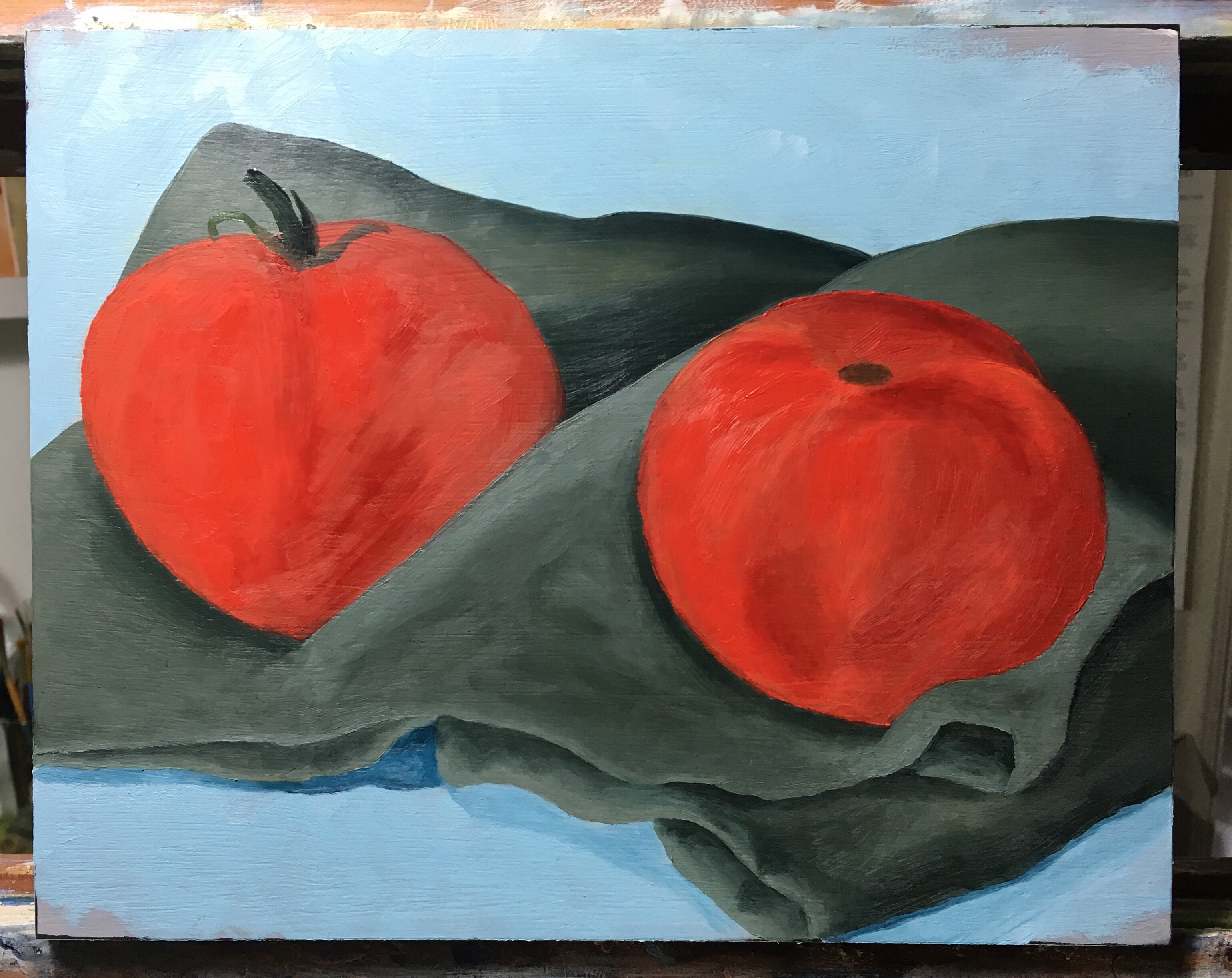
I had a tough time applying myself today. And this did not turn out how I’d imagined it in my head. I’m a quarter of the way through though.
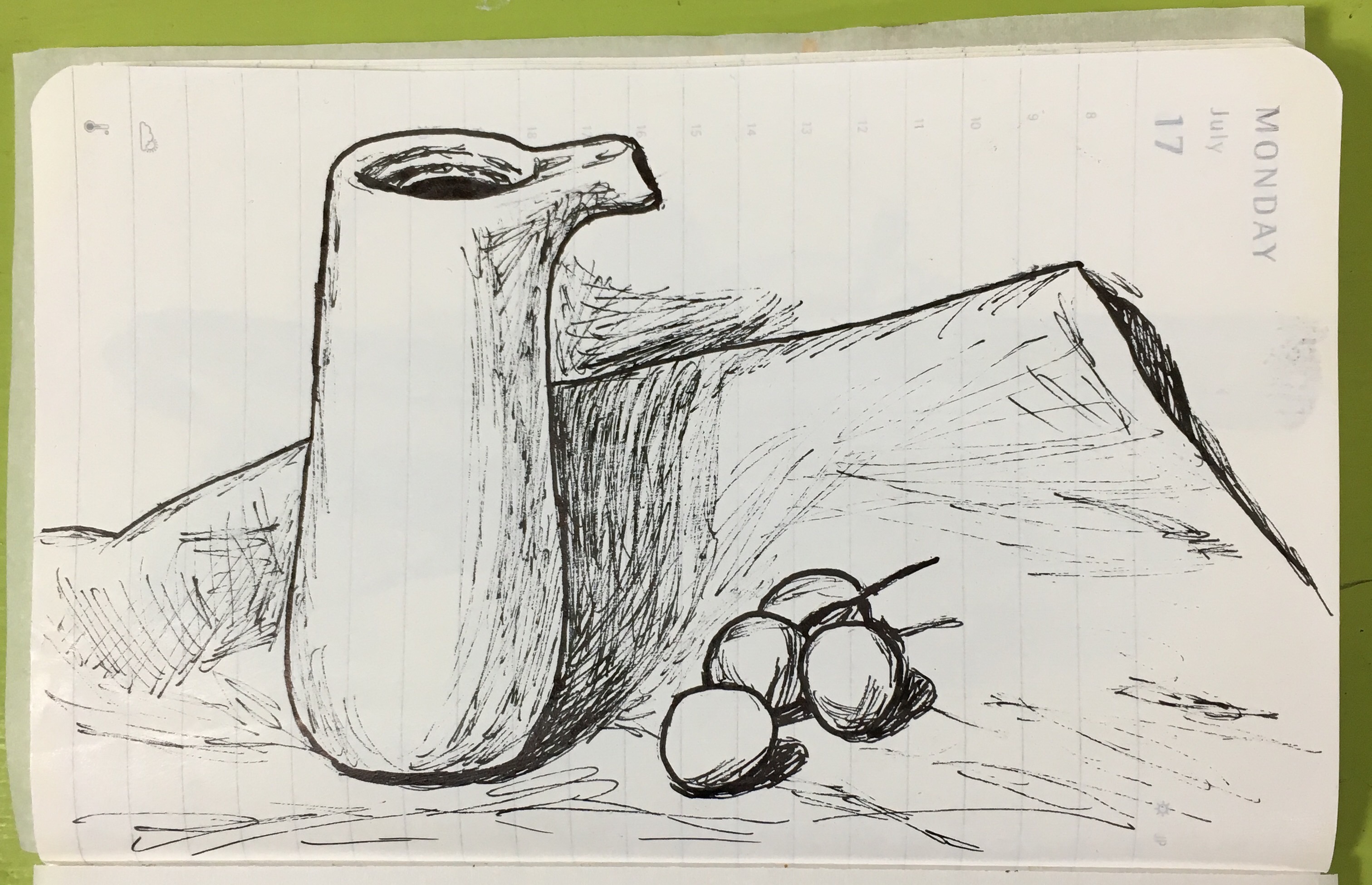
Another painting done and I enjoyed this one more.

I drew it out first, but found that frustrating. I had a lunch date and had to rush off after I finished it, thinking I’d photograph my still life set up later to post. And then I ate the grapes as I was running out the door. Of course they looked JUST LIKE in my painting. I started with a grey panel and I liked the experience of that. I’m getting a little annoyed with having to fill the whole background in; it feels uneccessary, so I prepped some panels to provide different background options. They’ll need a few coats of gesso before they’re ready, but we’ll see how that turns out. Could be good, could be a learning experience…


Why is it that my peppers always look like pumpkins?
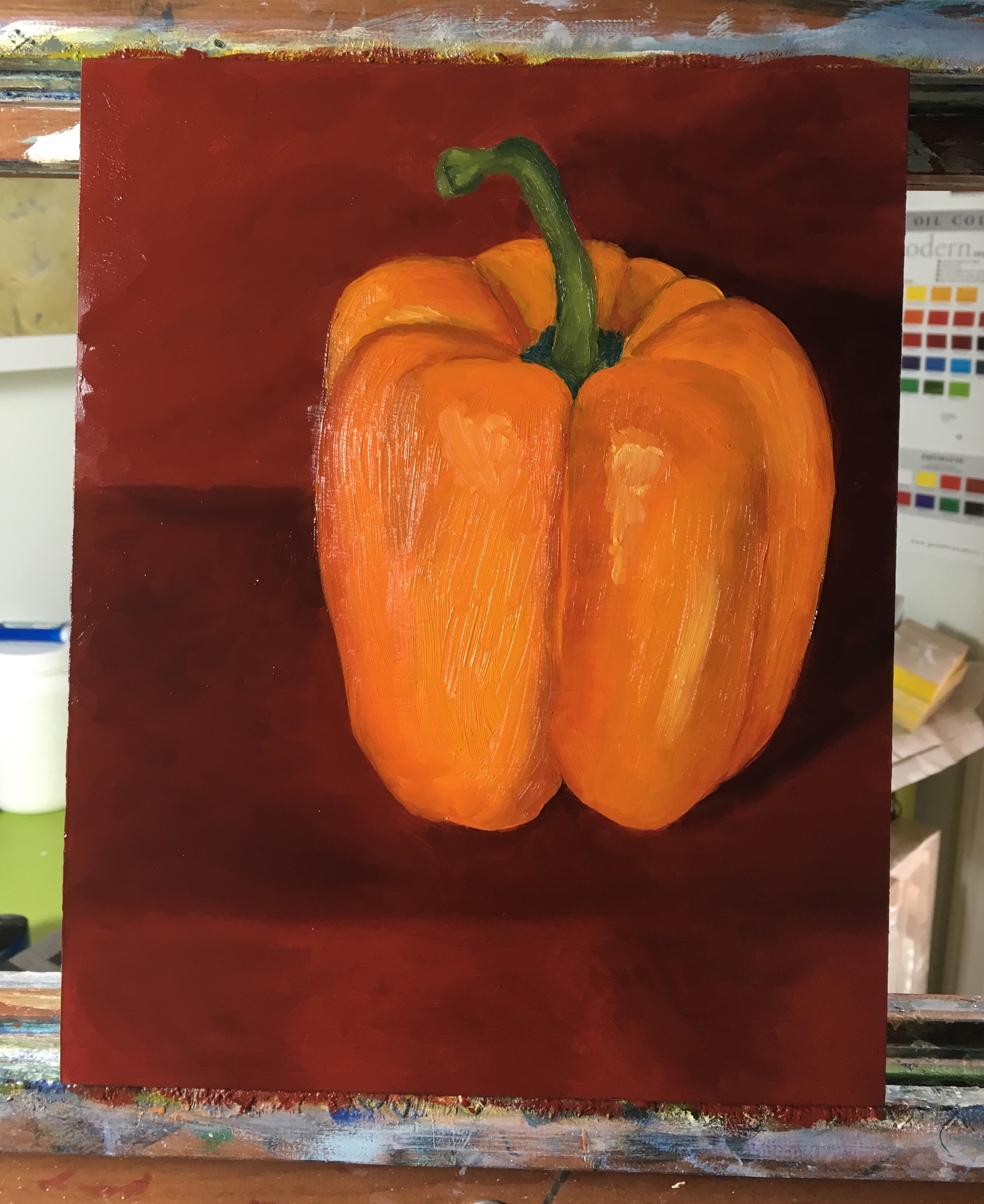
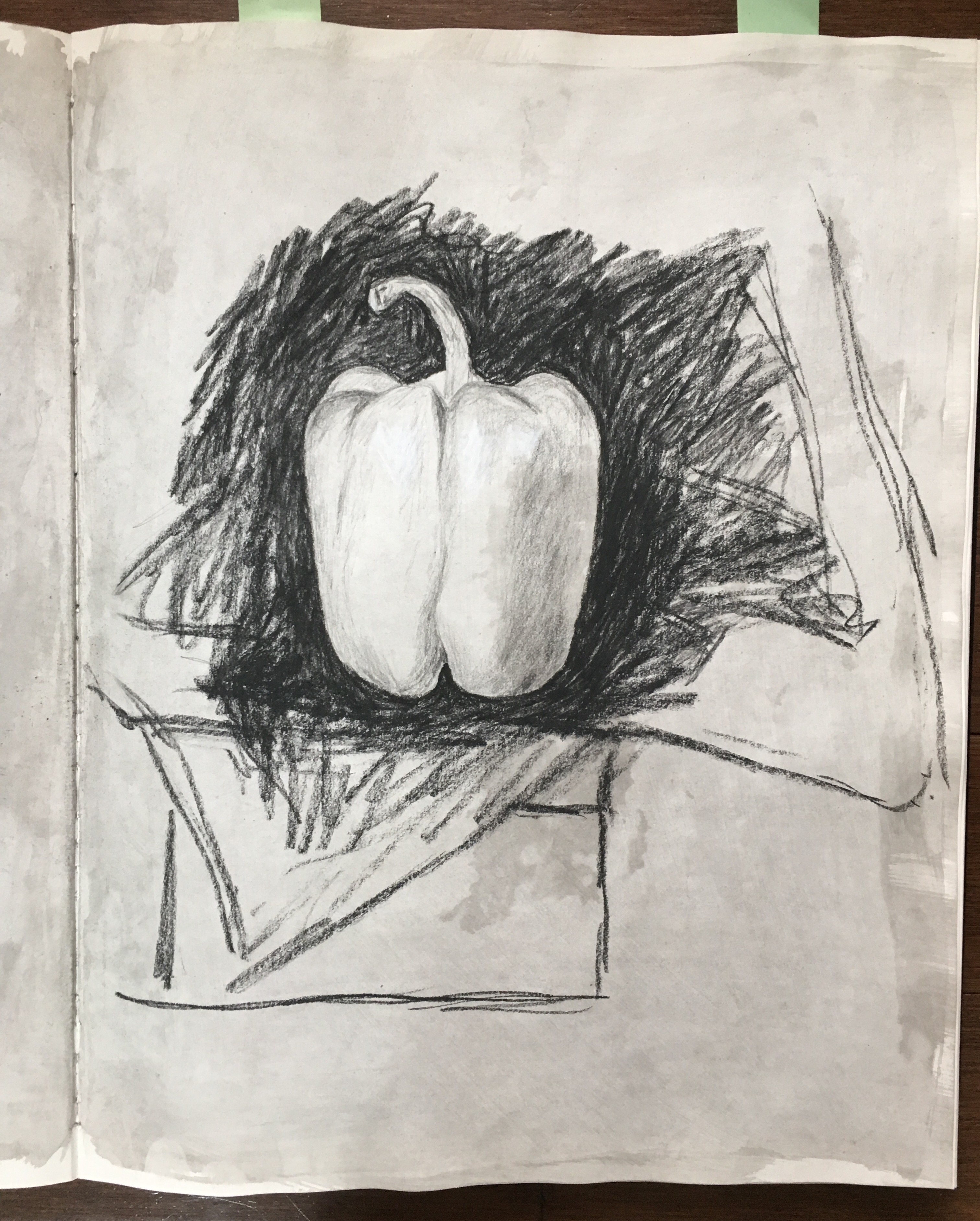
I’m a little happier with this one. I struggled with the colours I used for my shadows on the pepper itself and I might have found a better option had I experimented a bit more. I started with a charcoal drawing of the same pepper in order to get a good sense of the tones. I think that helped.

I have painted very little this year – I just haven’t felt like it. And I think that’s a pretty poor excuse. So now that I’m on vacation, I have decided to paint a small still life painting every day until I go back to work on August 1. I’m hoping this will motivate me to push through and just do the work. It may not be pretty, but I am determined.
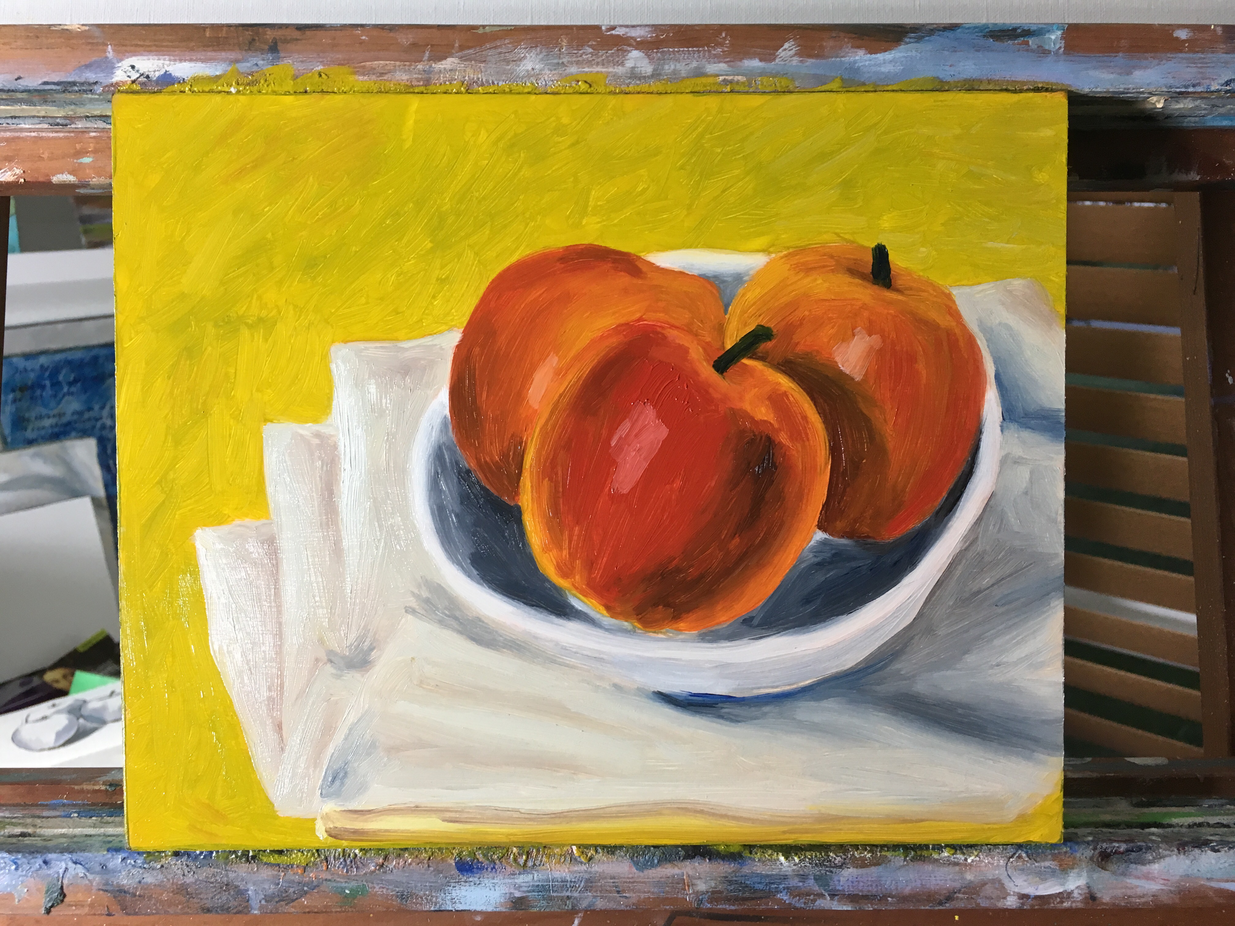 This was difficult. I was tired and did not feel like doing it. But I don’t always feel like doing my daily drawing and I just do it anyway and I did the same thing here. I started by covering my 8″ x 10″ panel with a diluted layer of burnt sienna and then did a quick drawing of my subject with more dilute burnt sienna before wiping away the paint from the lightest parts of the image. From there I mixed a few colours and filled in some of the major pieces a bit roughly. Then I moved from area to area filling in details and adding tone. I don’t know that I have a really great process – I’m working on that concept yet – but it got me through this painting. I don’t love the result. I see some depth created with the apples and the bowl, but the background is really flat and weird. And you can see that I rushed at the end with the fabric that the bowl is sitting on. I included this bit of folded canvas because I like painting fabric, but I was just too tired. And that’s one painting done.


I liked this format for a colour wheel so much that I decided to go on and do another one using primaries and secondaries directly from the tube based on Betty Edwards recommendations in her book Color: A Course in Mastering the Art of Mixing Colors. Colours used are Cadmium Red Medium, Cadmium Yellow Pale, Ultramarine Blue, Cadmium Orange, Cobalt Violet and Permanent Green. I added Titanium White and Mars Black for the tints and shades. I could have done some smoother gradations on this one, but it serves its purpose all the same. And no brushes to clean!
February 7, 2017


January 16, 2017
My work from the last two weeks:


The latest in the 6″ X 6″ Circle Composition series:

And my daily drawing challenge so far:


December 19, 2016

I managed to work on three different pieces this weekend. This one was looking so much like a bullseye that I decided to add the eye.

Possibly too colourful, but I thought I’d try a different approach and this is where I ended up.
And I have decided that this is now finished. Unless of course I decide to come back to it at some point. For now though, it’s done.
