“In the end it all comes down to this: you have a choice (or more accurately a rolling tangle of choices) between giving your work your best shot and risking that it will not make you happy, or not giving it your best shot – and thereby guaranteeing that it will not make you happy. It becomes a choice between certainty and uncertainty. And curiously, uncertainty is the comforting choice.”
– Art & Fear, David Bayles & Ted Orland
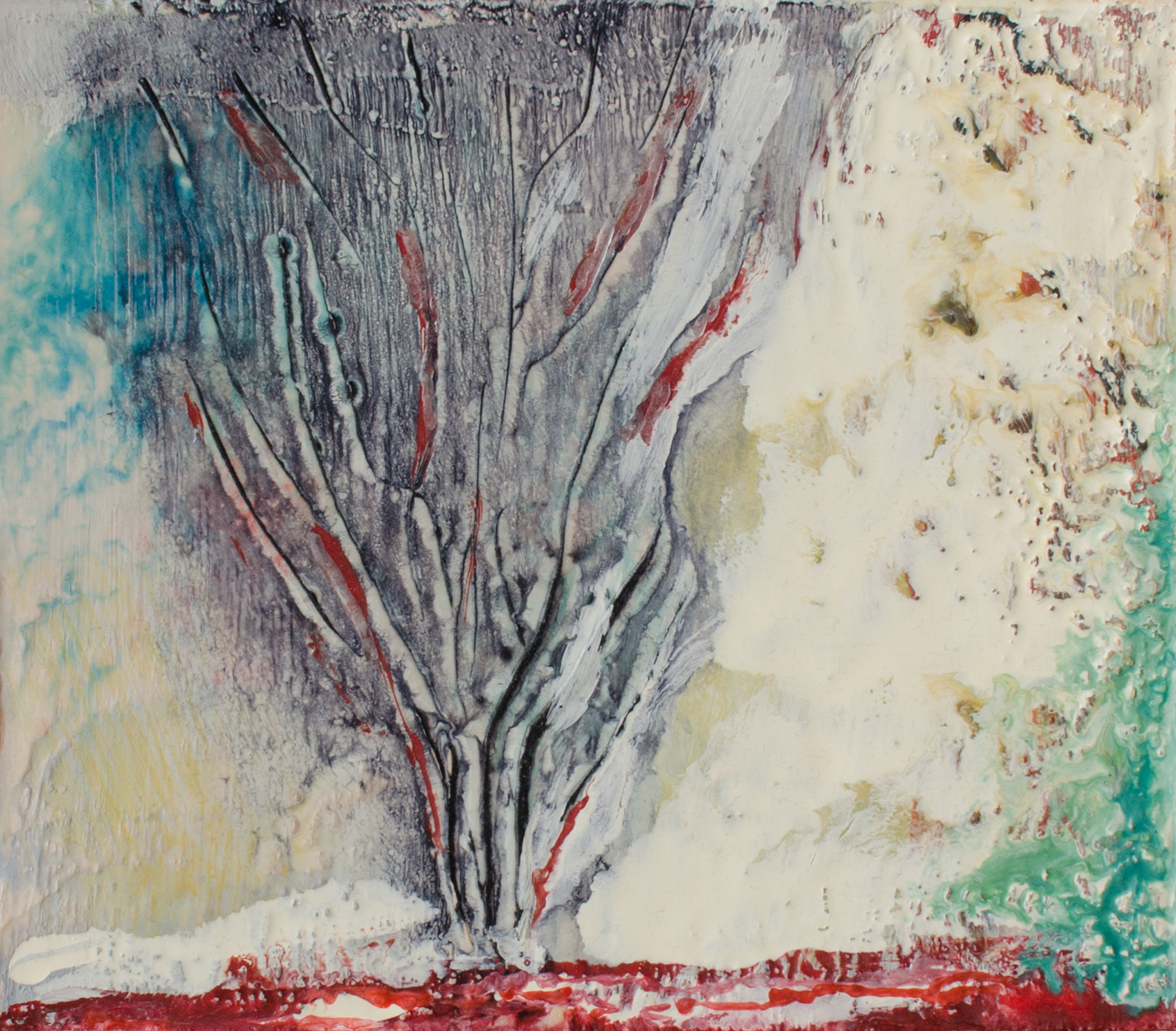
Here’s the beginning of a larger painting that may take some time to complete…
Red Ginger in Blue WIP, Aug 9, 2014, Oil on Canvas, 30″ X 35″
Quote courtesy of William Butler Yeats, referring to the literary criticism that he did to earn extra money.
Splash, Jul 26, 2014, Acrylic on Canvas, 17.75″ X 15″
I am absolutely and totally 100% ambivalent about this piece. My intention was to have some fun. Not sure if I accomplished that or anything else. But it is what it is. Nothing ventured, nothing gained.
Having recently read “The First 20 Hours”, I decided to put it into practice. I have studied colour theory before, so it’s not a topic that is entirely new to me, but I figured that I have a lot to gain by re-educating myself on colour theory and colour mixing. Right now it’s not a skill I can brag about. So I’m getting to know my friend Betty Edwards a bit better with her book “Color A course in mastering the art of mixing colors” and besides the fact that she continually leaves out the U in COLOUR, I am finding it very helpful. Some of what I have learned so far:
Betty firmly believes (and I agree) that artists should be trained sequentially in, FIRST, drawing – learning to use line and then to add VALUE, SECOND, colour theory and LASTLY, the combination of these skills to create paintings. This is very logical in my mind. not absolutely necessary, but it appeals to my methodical side. In fact this reminds me very much of a particular post by Robert Genn that informs my personal educational mission to improve my skills as an artist.
Betty has a three step algorithm for mixing colour – again, how can this NOT be cool? Now if she could only break down the painting of the Sistine Chapel into three similarly straight-forward steps, life would be truly good. Steps are: 1. Identify the colour wheel HUE that is the base of the colour. 2. Identify the VALUE of the colour and 3. Idenitify the INTENSITY of the colour. And mix the colour. Very helpful.
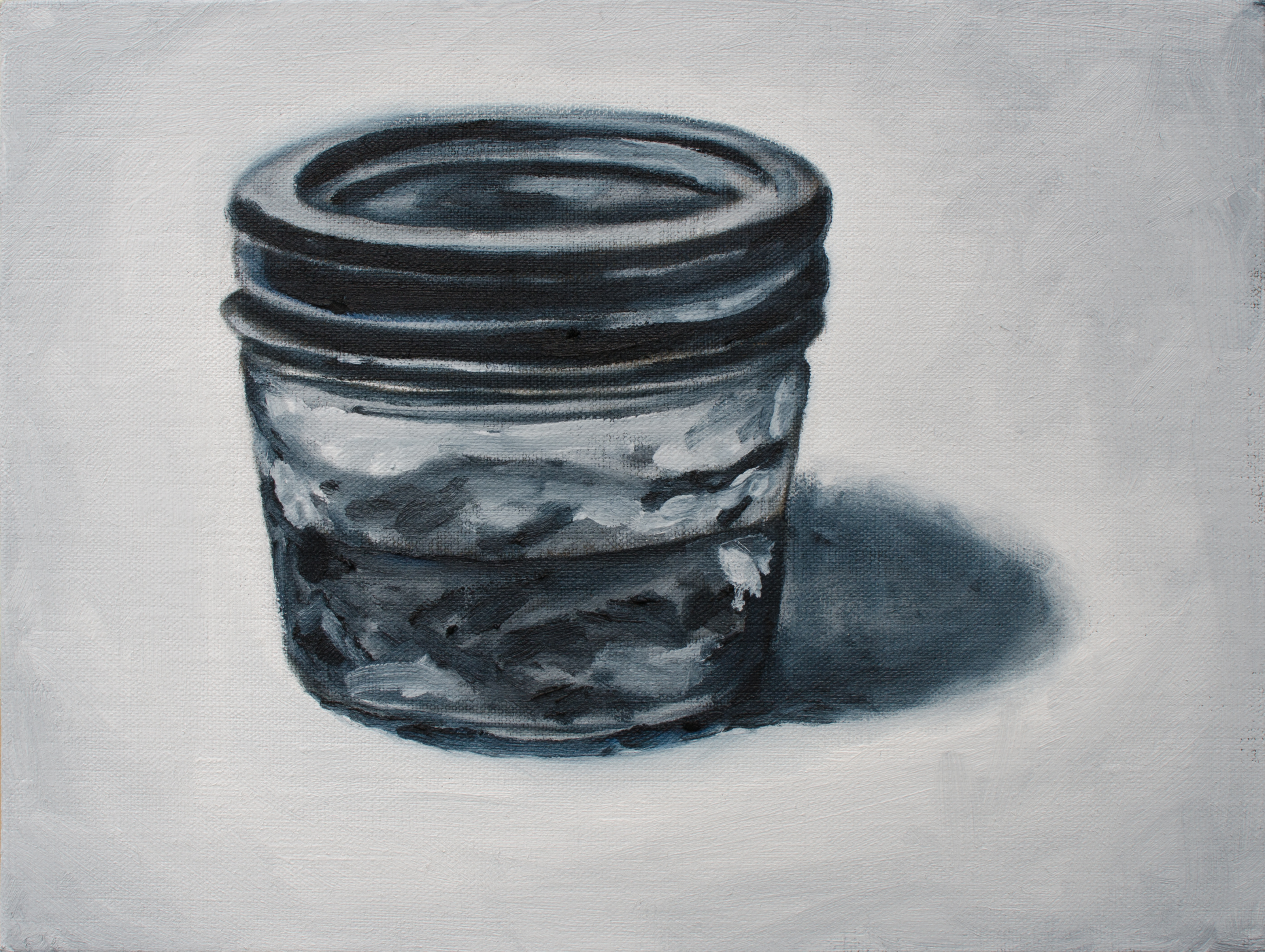
Having moved my painting materials and set up a new space to work in, I kind of liked the look of some of my supplies on the work bench. So here they are… and then seeing how badly the jar of stand oil went, I made a second attempt – a little better, but still off. Perhaps I will take another shot at it down the road.
Stand Oil, Jul 7, 2014, Oil on Canvas Board, 12″ X 9″Supplies, July 4, 2014, Oil on Canvas, 16″ X 14″
To commemorate Canada Day I stayed up late working on this bit of paint on canvas. Visited the Art Gallery of Alberta as they had free admission for the holiday and felt creatively inspired seeing the exhibition commemorating 90 years of the Art Gallery’s existence in Edmonton. I was feeling patriotic and proud to see such amazing works of Canadian artists on display.
As I’m on vacation from work I figured I had better take advantage of the opportunity and paint as much as I can. I’ve been feeling too comfortable (read: bored) with the monochromatic pears on squares, so although I was intimidated by this image, I decided that risk equals return and although I may fail big, I had better step outside my comfort zone and try something new. Here’s my lovely little curly bamboo stalk. I brought this little guy home from his surrogate home at Ikea pretty much two years ago – although it feels like yesterday. He’s been diligently growing new leaves and continuing his spiral journey towards the sky (aka the ceiling of our office/studio/bonus room – but let’s not rain on his parade just yet…). I’m not sure if the yellow leaves are normal or a sign that I’m a negligent caretaker… If my memory serves me, I believe I have watered him at least once since he came home…
Curly Bamboo, Jul 1, 2014, Oil on Canvas, 13.5″ X 17″
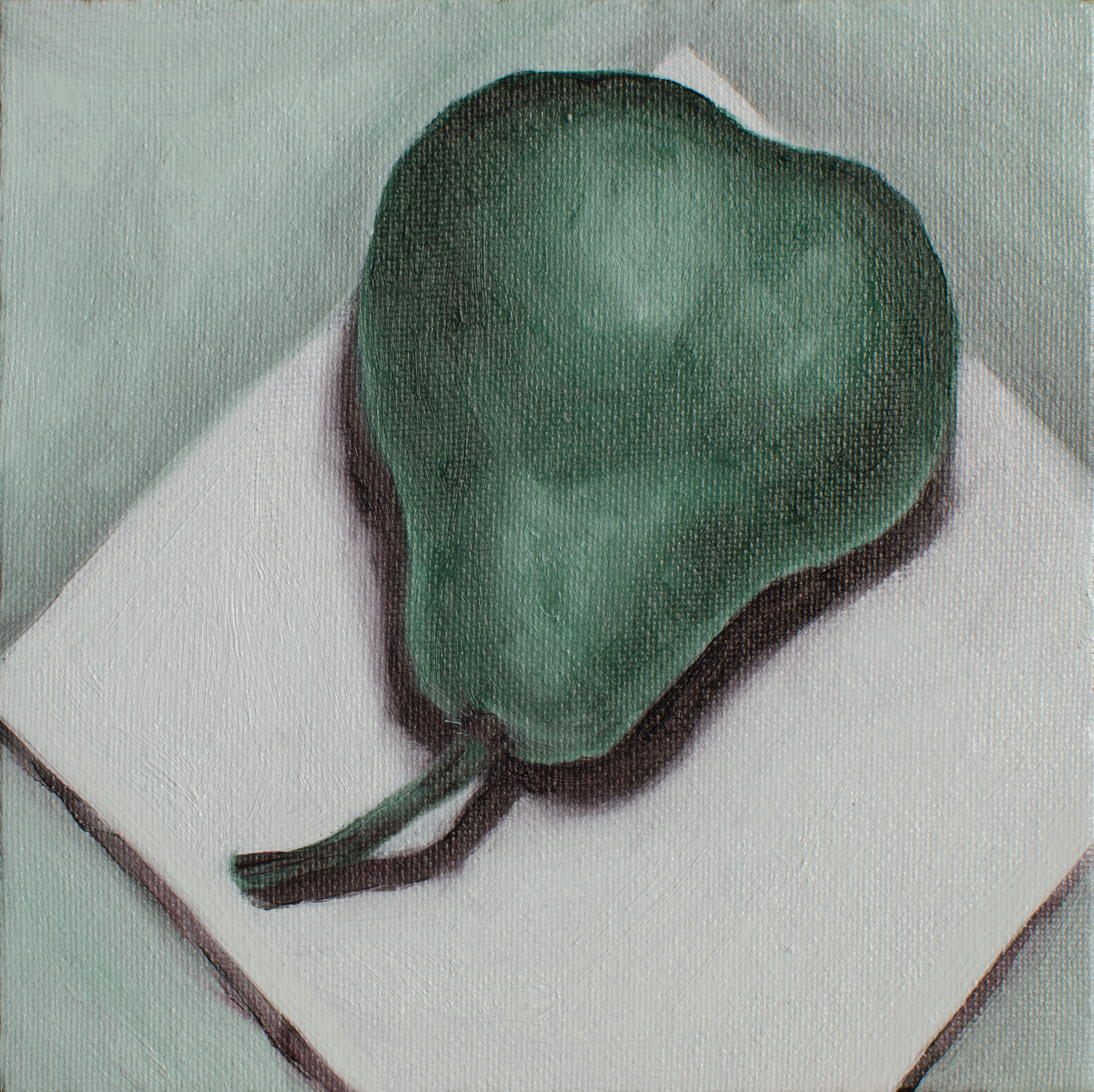
Continuing on with my monochomatic pears on squares I decided to avoid the use of black and instead create my shadows with the addition of the complement of the colour of the day. I’m not thrilled with the resulting colour. And I’m getting a little tired of pears.
Terre Verte & Alizarin Crimson, Jun 29, 2014, Oil on Canvas Board, 6″ X 6″
Sitting at my computer tired – mindlessly going through OneNote pages from 2011, blindly transferring them to Evernote. I committed to painting tonight, but I’m very tired and not looking forward to it. I procrastinate. It’s 10 pm and the house is asleep. I wash my face hoping it will make me alert. I begin. It doesn’t exactly flow, but I sip my red wine and engage in my painting ritual. I’m no longer sleepy.
Burnt Sienna, Jun 20, 2014, Oil on Canvas Board, 6″ X 6″