April 6, 2014


ok, I kind of like the chocolate right in front. But not the wrapper and not much else. Perhaps I shouldn’t have refilled my wine glass that last time…
April 6, 2014
ok, I kind of like the chocolate right in front. But not the wrapper and not much else. Perhaps I shouldn’t have refilled my wine glass that last time…
March 30, 2014


“Between the idea
And the reality
Between the motion
And the act
Falls the Shadow”
– T.S. Eliot
Having for some reason been reminded of Wayne Thiebaud’s work, Samantha and I made an extra stop today to find some cupcakes that I could paint. As they were fairly coveted, I photographed them when we got home so that we could enjoy eating them BEFORE I painted them. I also photographed ball bearings, apples and glasses half filled with water. (perhaps a result of the lingering effects of seeing Divergent this afternoon.)
In looking at the photos and feeling very un-inspired and mundane, I chose the half-full glass over the cupcakes. (it’s likely the cupcakes will show up down the road.) I was intrigued by abstracted, close up bits of the image on my computer screen and although my intention was to paint one fairly realistic image of the glass, I decided to attempt two detail bits and to play a little. Minimal colour and contrast and yet something I found interesting.
I had spent the week looking at pretty amazing artwork and feeling very mediocre. When I grow up I hope to create work like Heather Hingst Bennett – I am enamoured by her minimal, painterly brush strokes that so beautifully depict her subjects. And I am eternally envious of Lucia Dill’s chairs. Perhaps one day I will be able to so emotively depict everyday objects that somehow express such human situations. I am both so very inspired and yet completely dejected by these artists when I so clearly see the gap between where I am and where I want to be. And yet I can’t not continue. For whatever it’s worth…
March 23, 2014
Vancouver Public Library completed. I don’t love it, but I don’t really want to continue to mess with it either. It is what it is and I will move on to the next thing.
I’m still working on adding my older artwork to the appropriate pages. And I’ve decided to add a new page showing pieces as they progress and are completed. I am always interested in seeing how different artists develop their work and thought perhaps I could learn something from observing my own processes.

“Libraries are the thin red line between civilisation and barbarism.”
– Neil Gaiman
March 9, 2014
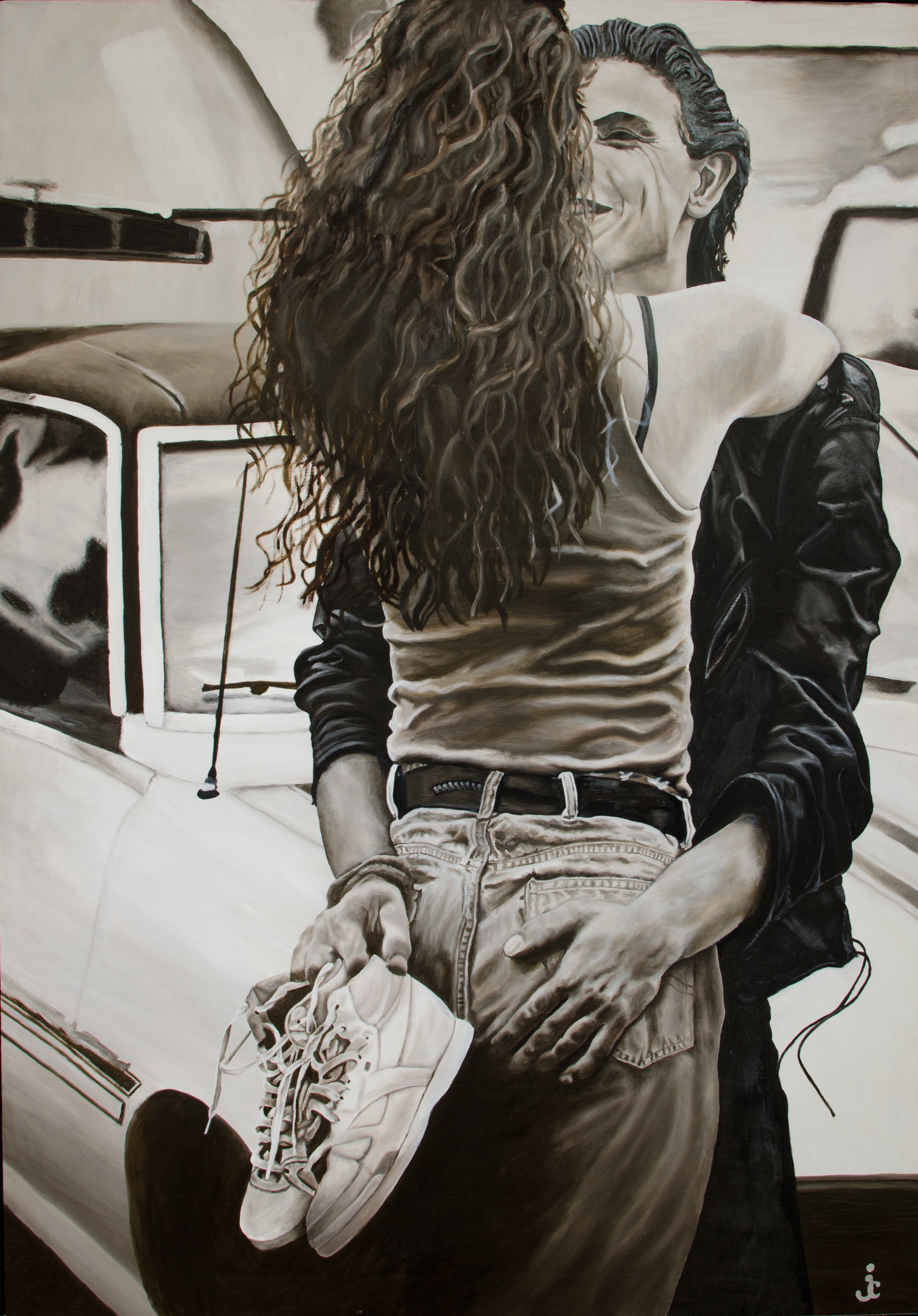
An assignment in the current painting class I’m taking – one I enjoyed in fact. I have to state up front that I didn’t actually draw the image, I transferred it onto the canvas from a photocopy of a photo of James Dean. But I did have fun playing with oil paint again. And the pervasive smell of linseed oil that still lingers. Below that is another little image resulting from a little playing with a new medium – Liquid Pencil. I quite like the text of the book page as a background and am trying to create something a little larger like that.


March 2, 2014
“We let our battles choose us.”
Yes Lorde, that may be the case. And perhaps that is as it should be – as long as we fight them honestly. And develop our own artistic style along the way.
Two choices:
1. Scroll down immediately to see two new paintings
OR
2. Read my rather wordy reflection on my evening of painting.
Both equally valid options.
Back in January, when I decided to redefine the content of my blog and focus on my artwork I had thought I would write about my process from time to time – because I love to read about the process of other artists. But so far I haven’t. Until now. This is a bit new to me and I’m not sure if it comes naturally or not, but here goes. Let’s see if I can learn something from it….
So.
Inspired by a recent exposure to paintings by Lawren Harris (and in spite of the fact that I kind of never liked the Group of Seven as they seemed like a real Old Boy’s Club while poor old Emily Carr, on the opposite coast was living on the edge thinning her paint with gasoline out of poverty while smoking like a chimney in some sort of subconscious death wish…) I decided that perhaps I could learn something and have some fun if I played with recreating one of his paintings.
My goal wasn’t to recreate it exactly, and really, I had no specific intentions as to exactly what I would do with it – would I change the colours? Perhaps blend where he had defined edges and define edges where he blended? Or something else? I just started and went. I picked colours that I haven’t worked with lately plus a few old favourites to see what they would do together and to explore. In the process I discovered a couple things:
1. I’m not sure I will ever really like acrylics – specifically for all of their defining features. Which begs the question, why am I using them? Is it time to switch mediums?
And
2. I am really up in the air about the purpose of recreating other accomplished artists’ works of art.
How decisive and profound….
or not…
The backstory:
1. The first painting medium that I ever loved was oil paints. It was a combination of the texture and the way I could play with it on the surface of the canvas and blend and blend and basically rub all of the substance of the paint away to leave behind only the stain of colour and really worn down brushes. I rarely mixed colours on my palette. It was a tactile and almost mindless repetitive process and (being a teen-age girl with my mind on many others things) I found solace in it. And yet, having been required to work with acrylics in university and feeling somewhat daunted by the cleanup required for oils and what I expected to be small windows of time to create and finish paintings, last May, when I re-committed to painting again, I decided that I would paint in acrylic. I felt I had accomplished a fair bit of proficiency in college with gouache (also fast-drying without the luxury of a lot of blending opportunities) and had fared alright.
So I went to the candy art store and noticed Golden’s OPEN ACRYLICS line – acrylics that dried somewhat slower than the norm. And I bought some. And I hated the consistency of the Titanium White – far too thin for my taste. None of the buttery texture that I love about paint.
What I hadn’t realized was how “OPEN” it really was. With my Lawren Harris experiment, having run out of the OPEN version of Titanium White, I resorted (with a sense of relief) back to the typical Golden Titanium White and was pleased to find the thicker texture I had been missing. And then I started to paint. And realized that perhaps I was sadly mistaken to think I could ever like acrylics. Mid brush stroke, once again disappointed to find my paint drying far too quickly, I realized that I had no idea as to what I was trying to accomplish in this small area of water up against the rocks and, really, completely without a vision of where I was going with this painting. And kind of hating the result too. (but maybe I’ll like it when it develops a bit more…?) Am I trying to blend? Am I creating defined edges? What the hell colour am I really looking for and just how many brushes can I hold in one hand as I am repeatedly frustrated with the dirty greenish-yellow colour that I’m dragging through the snow here?
The conclusion I draw from this experience is that I need to reconsider my medium. Even as I cringe to think of all of these brand new, still practically full and not inexpensive tubes of acrylic paint carefully arranged in front of me.
Hmmm.
When exactly does productive experimentation become self-punshment?
Yes, I am still daunted by the image of the endless cleaning process of oil paints (not to mention the environmental arguments against them).
I could consider the water-soluble oils, but something about my Ukrainian/Saskatchewan upbringing makes it really hard to think that that is a genuine option to consider. (nope, absolutely no logic there, just gut feeling.)
So, a decision to be made…. acrylics, or oils? Have I earned it? Do I need to EARN it? Hmmm.
2. Although it may not be evident looking at my recent paintings, once upon a time I was working diligently towards a fine arts degree in painting. But rather than finishing that degree, instead I transferred out of the studio courses and into the dark lecture halls and dry seminars of an honours degree in art history. (Two reasons: I really LOVED art history. And I had no idea what I wanted to express as a painter exactly at that point in the degree where they want you to start committing to a particular style. Three being I did NOT want to be another “poser” pretending I knew what I wanted to paint when I was really just painting exactly what a particular prof liked about my work which somehow seemed to resemble to a great degree HIS work – not that anyone in my painting course ever did that… hey – if you are not authentic, who the hell are you ANYHOW?)
The assignment:
Pick a Renaissance painting and re-create it with an original twist that is all your own. And, somewhat arbitrarily – one of the dimensions of the painting must be 4’.
Shockingly, (considering my long-term Venus fetish) I chose Venus on the half-shell, cropped to a 4’ X 7’ format.
Towards the end of the process, while working away in class one day, listening to my very high-tech Sony Cassette Walkman, the prof, a very accomplished artist, came to chat with me.
After stepping back to review my progress, he asked me, “Have you ever read “What’s Bred in the Bone” by Robertson Davies?”
In retrospect, I should have said, “No. Why do you ask?”
But I didn’t. Instead, I said, “No, I haven’t.” And he profoundly said “Hmmm” and walked away.
He gave me a decent grade on the finished painting and I immediately went to the library and checked the book out. And I still really have no idea what his comment meant.
My point is, although many of the Renaissance masters spent years grinding paint and leaning how to paint by copying the masters of their generation, I really wonder where the greatest value lies in copying the work of other artists. Is it the process of trying to literally “COPY” the work? Is there value in the practice of attempting to reproduce what they created and perhaps make some of the same decisions while choosing and mixing colours and determining the appropriate tilt of the brush to achieve a particular paint stroke in an effort to not only recreate the painting, but to recreate the process – and within that to recreate the learning of the original artist?
Or is the value in the interpretation of using the painting as a starting point to then create something brand new and completely your own? I really don’t know. I guess at some point while reading that damn Robertson Davies book, I decided that I had no style of my own. (not that I ever believed I had the necessary skills to be an art forger either.)
And the result of this evening of painting and animated debate with myself over a lovely bottle of red wine: Where am I now? Still not sure. Time will tell.
Here is the end result.

And from nineteen years ago…

February 25, 2014
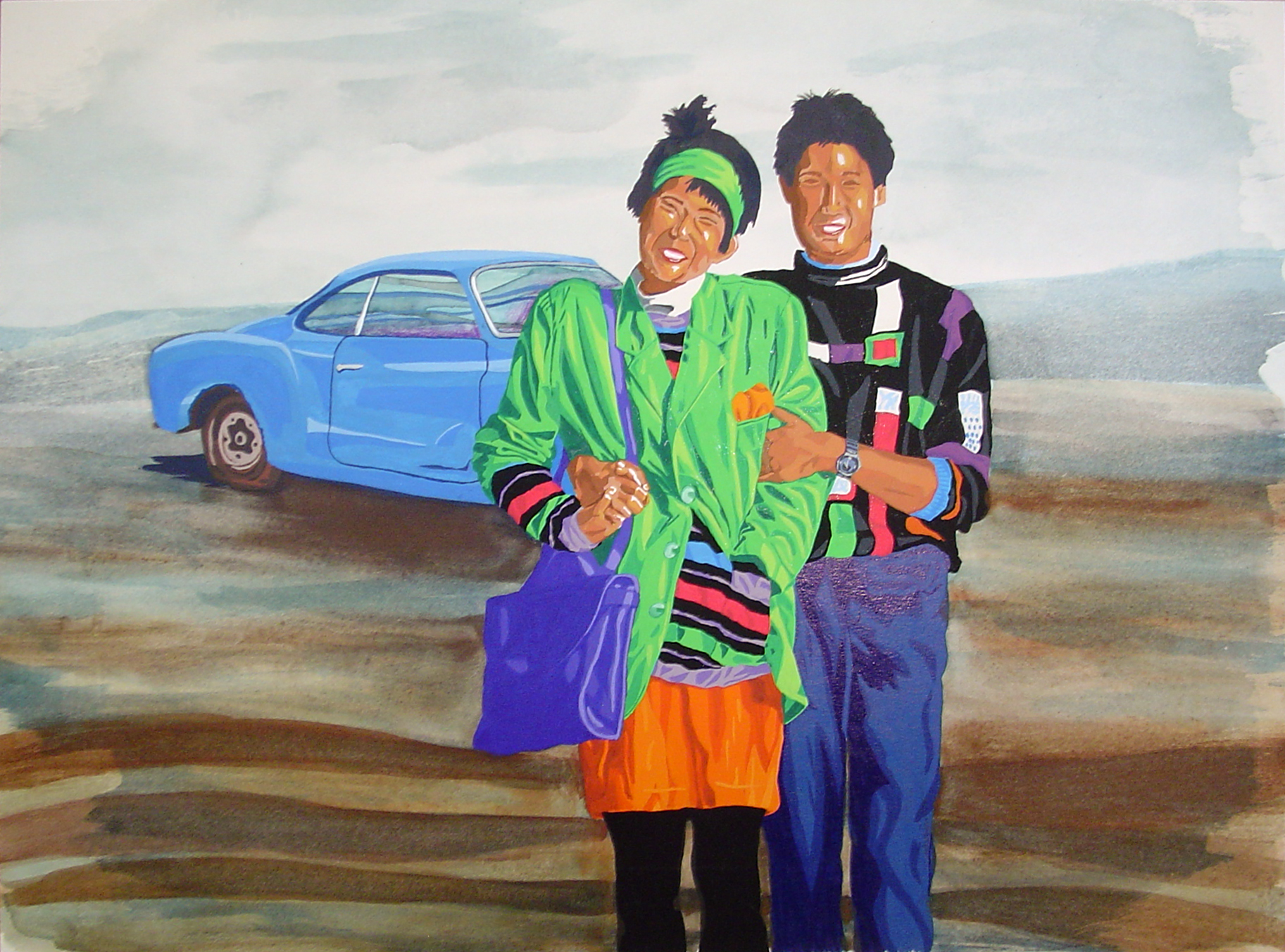
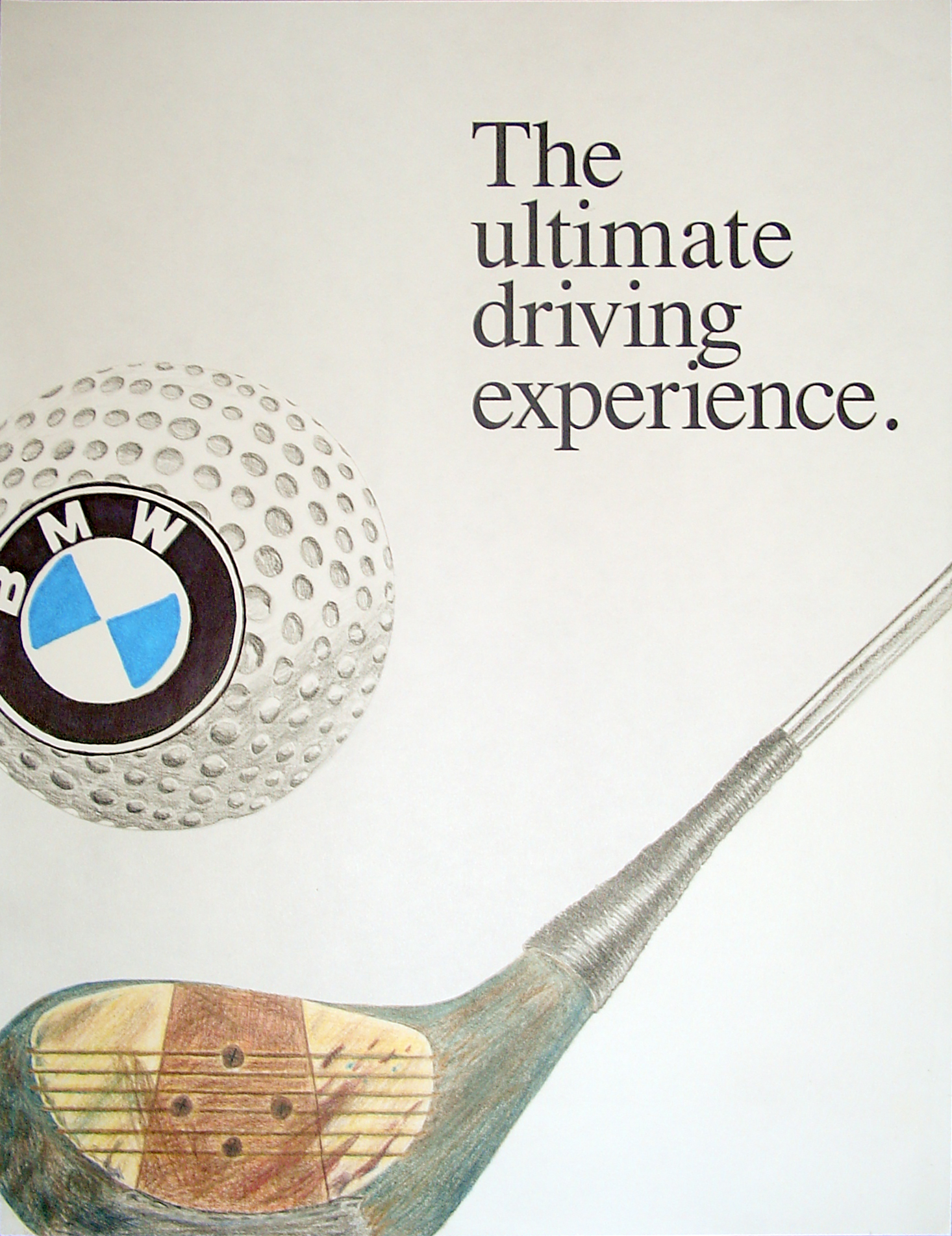
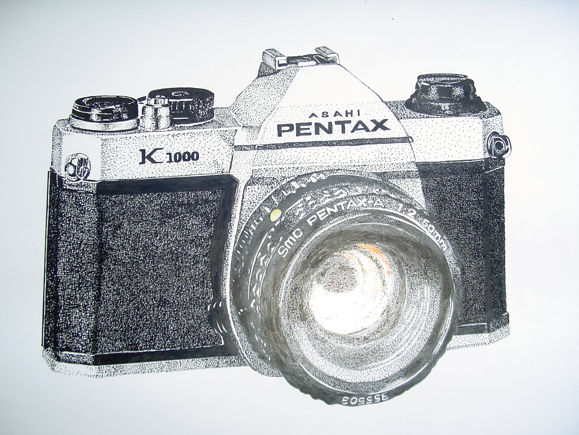
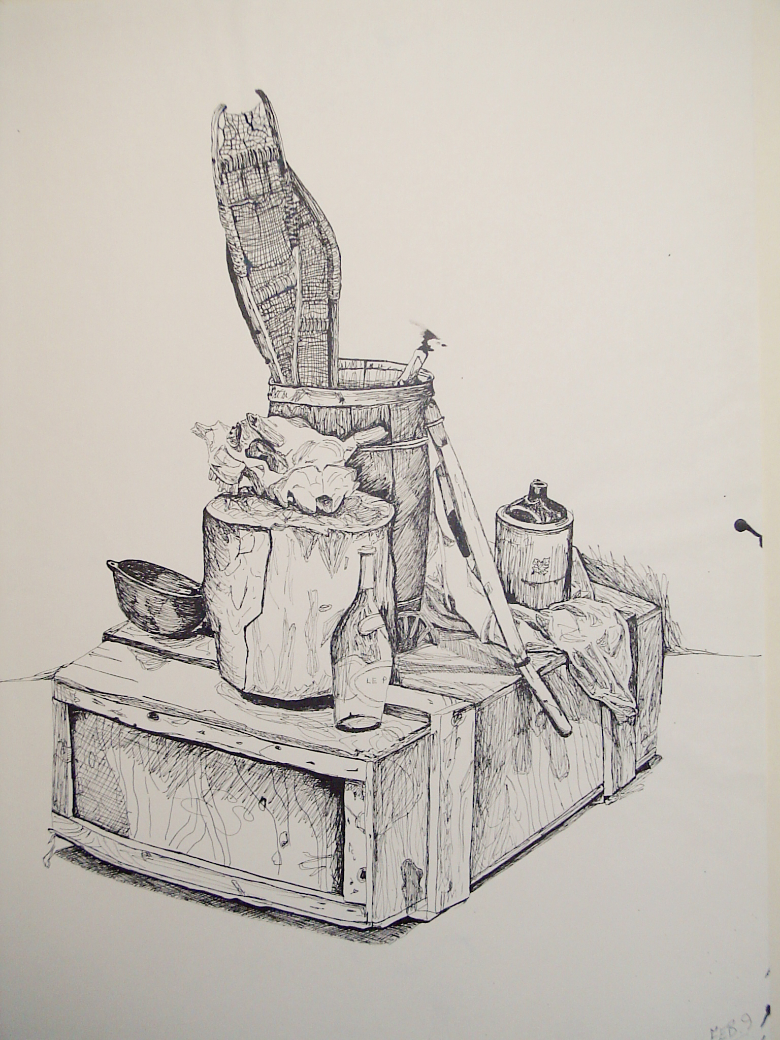
Having had no opportunity to paint this past week I have no new artwork for my blog. Instead I am posting artwork that I created in college while I was studying graphic design. After storing these pieces for years, moving from one place to another, about ten years ago I decided to photograph the ones I liked and to toss the originals. Sadly, what I thought were good photos at the time were very mediocre. And some of the dates are best guesses – as are most of the dimensions. Most of these were done as specific assignments – some quite obviously. Other’s not so much. Clearly I preferred some mediums far more than others. And maybe one day I’ll gain some rudimentary skill with watercolour – or not. And that’s ok. It is what it is.


February 16, 2014
“Life beats down and crushes the soul and art reminds you that you have one.”
– Stella Adler


The end of January and the beginning of a new look and purpose for my blog. I had meant to have everything all ready to go by now and all of my intended content uploaded and published, but I was far to optimistic in my time projections. So instead, I have changed some things and established the new structure, and am still in the process of compiling all of the content that I want to see here. My goal is to post weekly. Until I have all of my older work uploaded, I will post a combination of my current artwork and the evidence of my history – maybe it will turn into a nice illustration of skill development – a ‘then’ and ‘now’ kind of thing. Or not. Time will tell.
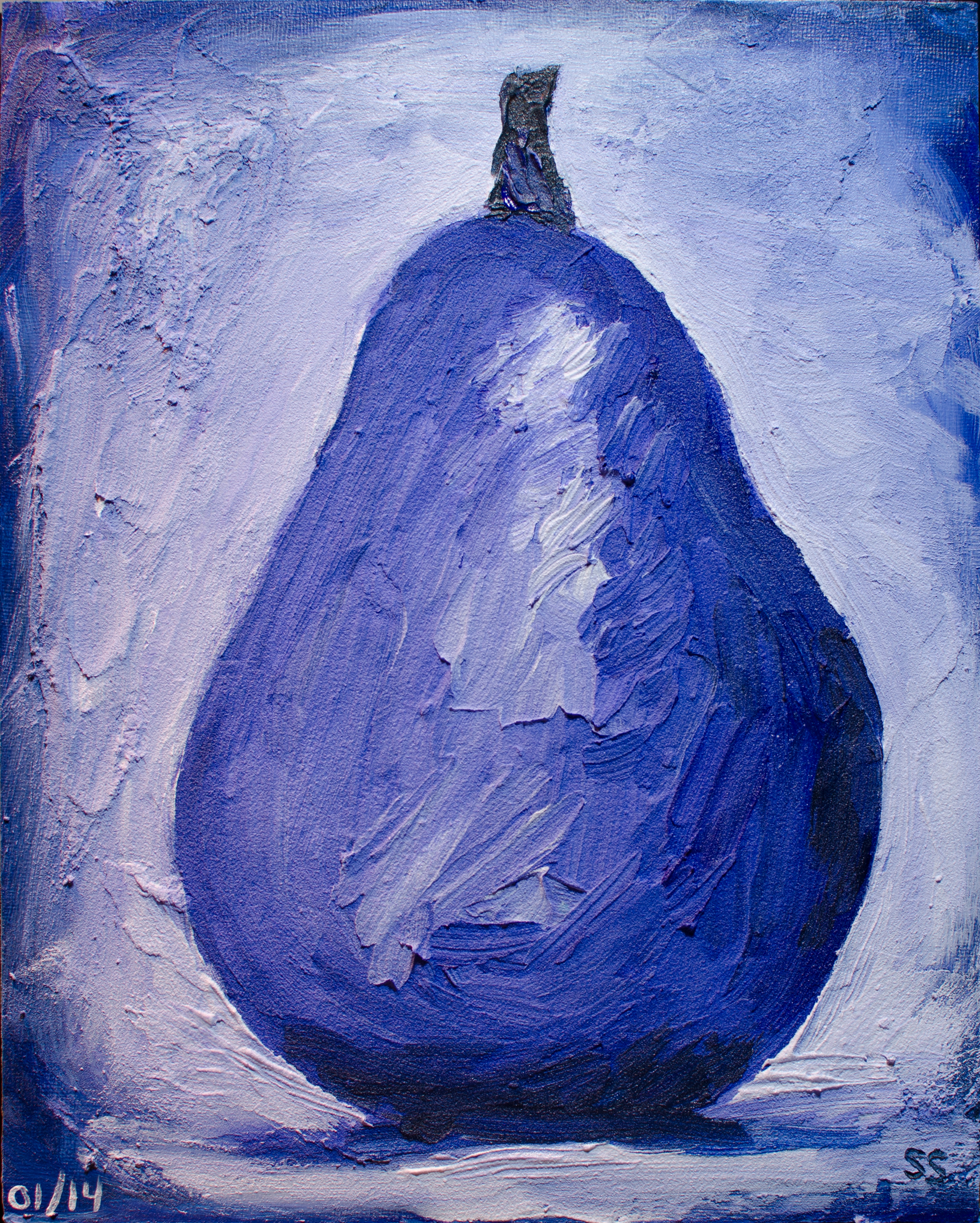
While a good portion of the world was celebrating on New Year’s Eve, I was hanging out with my paints and some pears (or a photo of pears in this case) with my daughter reading in the office with me so I wasn’t alone. I was trying to make use of the tubes of paint that my kids had picked out (thus the purple – plus a few ‘helping’ colours) and we shared Christmas chocolates late into the night. Samantha finished her book and I moved some paint around. Here are the results.

After a fairly focused piece, I wanted to loosen up a little and this is what emerged.
Lastly, a bit of my past. Probably the oldest painting that I still have in my possession and stretched on a frame. Painted from a Reebok ad in Rolling Stone magazine. This is when I fell in love with oil paints.
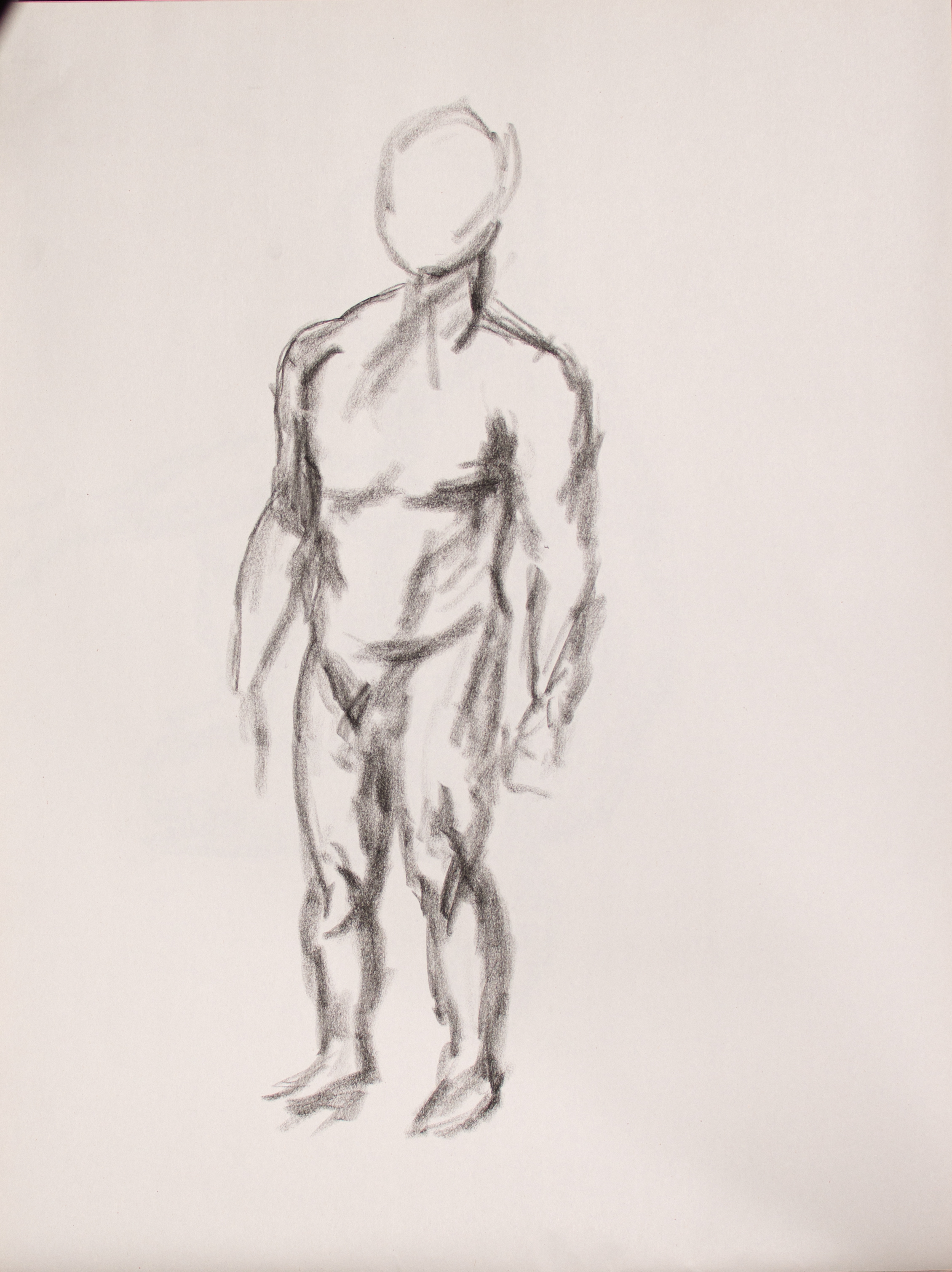
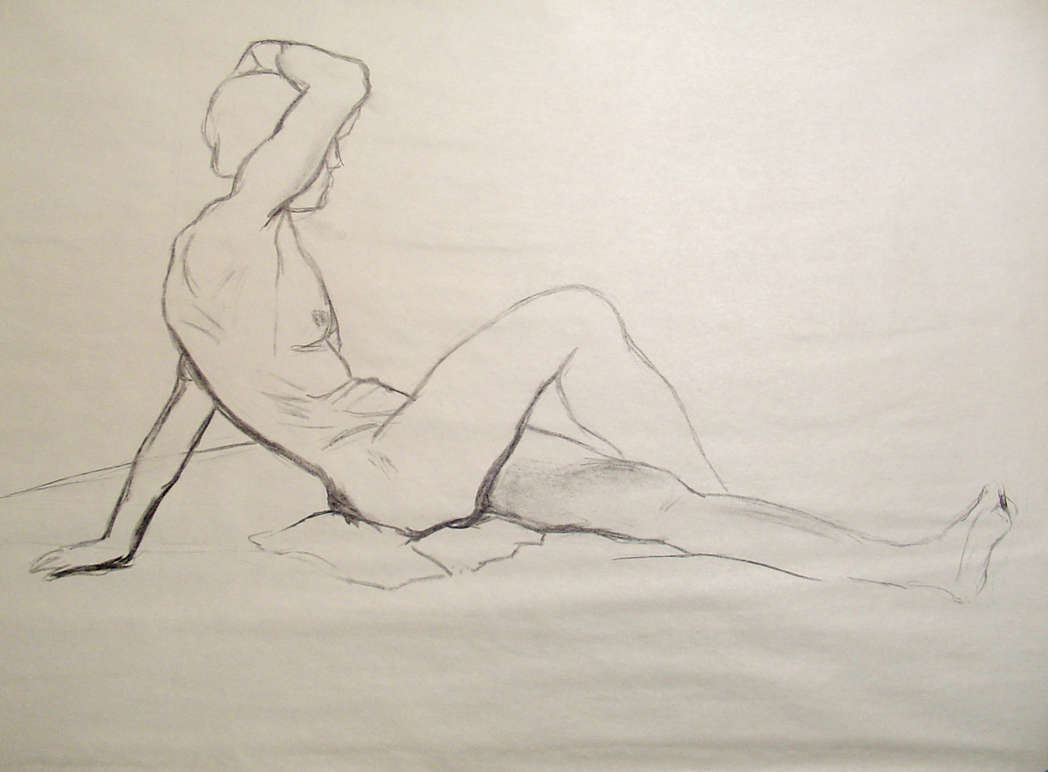
Another week of figure drawing class. And for a change I spent today painting, rather than staying up far into the night. I’m not sure I prefer it though – somehow time feels different in the middle of the night and I don’t feel as controlled by the clock. Not that I don’t suffer the following week from lack of sleep. Hmmm.
Figure Sketches, Vine Charcoal on Newsprint, 18″ X 24″.
Payne’s Grey Pears, Take Two, Acrylic on Canvas Board, 10″ X 10″.